6.0 KiB
Fluent Design from MDB inspired by Microsoft Design for the newest Bootstrap 5
Components in the newest Bootstrap 5 and Fluent Design. Completely new design using the latest Bootstrap
Installation
Create, deploy and host anything with a single command using open source deployment tool & free hosting
There's also written version of quick start available to show the simplicity of using MDB CLI tool.
To start using MDB GO / CLI install it with one command:
npm install -g mdb-cli
Then run:
mdb publish
That's it. Your project is available on the Internet.
Highlights
Free for personal and commercial use
Our license is user friendly. Feel free to use Fluent Kit for both private as well as commercial projects.
Components
Choose among 100+ predefined components. Each component is ready to use and fits perfectly with each other like LEGO bricks. Take, combine, enjoy!.
Modularity
Fluent Design for Bootstrap comes with both, compiled, ready to use libraries including all features as well as modules for CSS (SASS files) and JS. That allows you to create your custom library including only elements which you really use in your project.
10 fresh ready to use templates
We are going further and giving to you ready to use templates! Use them as you like, as an inspiration, prototype or final product for your customers.
Cross-browser compatibility
Chrome, Firefox, IE, Safari, Opera, Microsoft Edge - Fluent Kit loves all browsers, all browsers love Fluent Kit.
Modularity
Fluent Design for Bootstrap comes with both, compiled, ready to use libraries including all features as well as modules for CSS (SASS files) and JS. That allows you to create your custom library including only elements which you really use in your project.
Active community
Our society grows day by day. Visit our forum and check how it is to be a part of our family.
Flex box
Fluent Kit fully suppports Flex Box. You can forget about alignment issues.
jQuery 3.x and 2.x
Fluent Kit is integrated with newest jQuery. Therefore you can use all the latest features which come along with it.
SASS files
Arrenged and well documented .scss files can't wait until you compile them.
Detailed documentation
We give you detailed documentation at your disposal. It will help you to implement your ideas easily.
Live Preview
Main demo - check visual guide of components in the newest Bootstrap 5 and Fluent Design
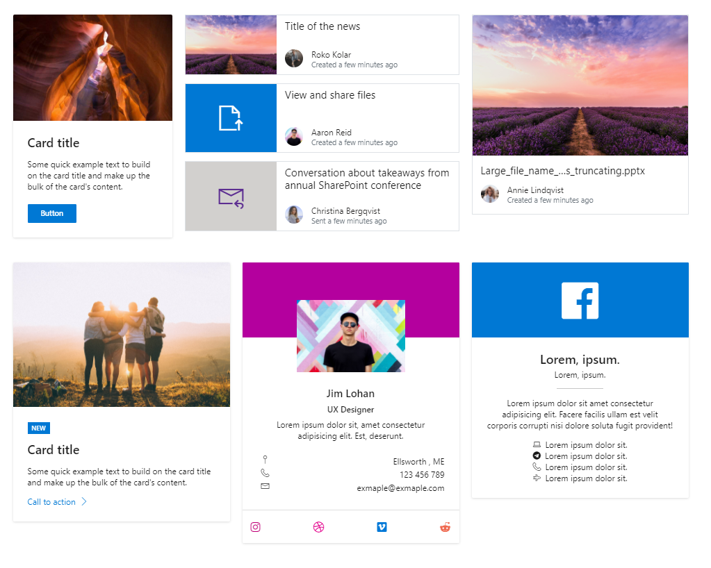
Cards
Card is a responsive content container with an extensible option for headers, footers, images, and a wide variety of content.
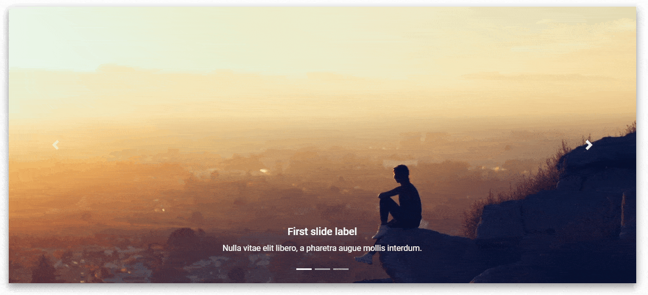
Carousel
A slideshow component for cycling through elements—images or slides of text—like a carousel.
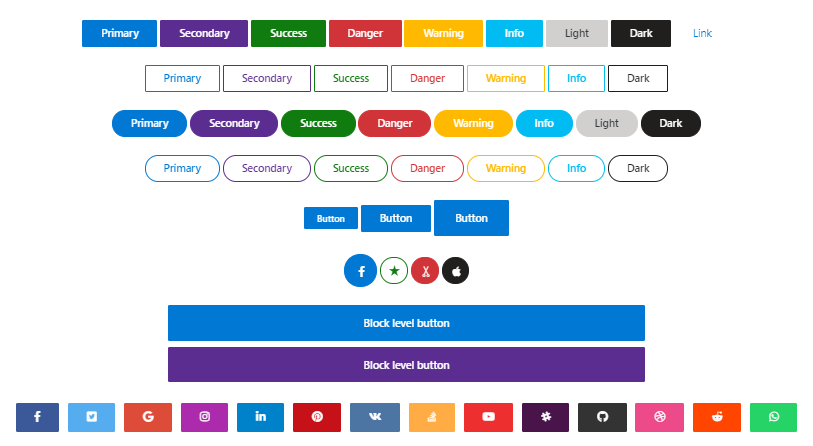
Buttons
Buttons provide predefined styles (warning, info, danger) for multiple button types: outline, rounded, social, floating, fixed, tags, etc.
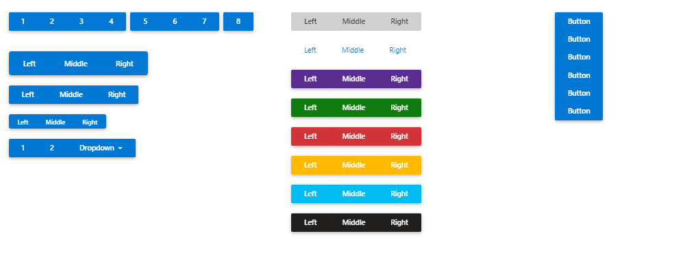
Button Group
Button group wraps a series of buttons together into a single line (navbar) or stack in a vertical column.
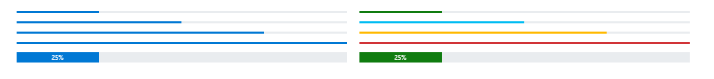
Progress
Progress bar is an indicator showing the completion progress, i.e. task or time. Use it with percents, steps & other options.
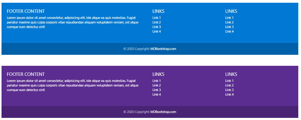
Footer
A footer is an additional navigation component. It can hold links, buttons, company info, copyrights, forms, and many other elements.
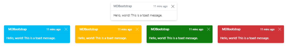
Toasts
Bootstrap Toast component is a non-disruptive message in the corner of the interface. It provides quick "at-a-glance" feedback on the outcome of an action.
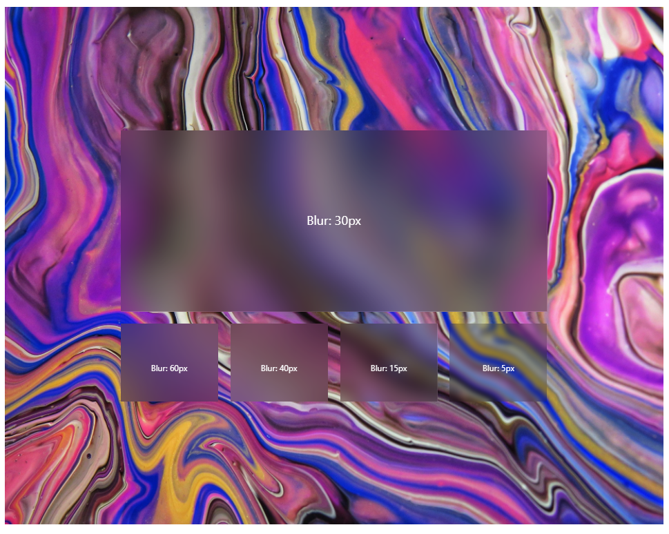
Acrylic

A big thank you to all our users who are working with us to improve the software. We wouldn't be where we are without you.